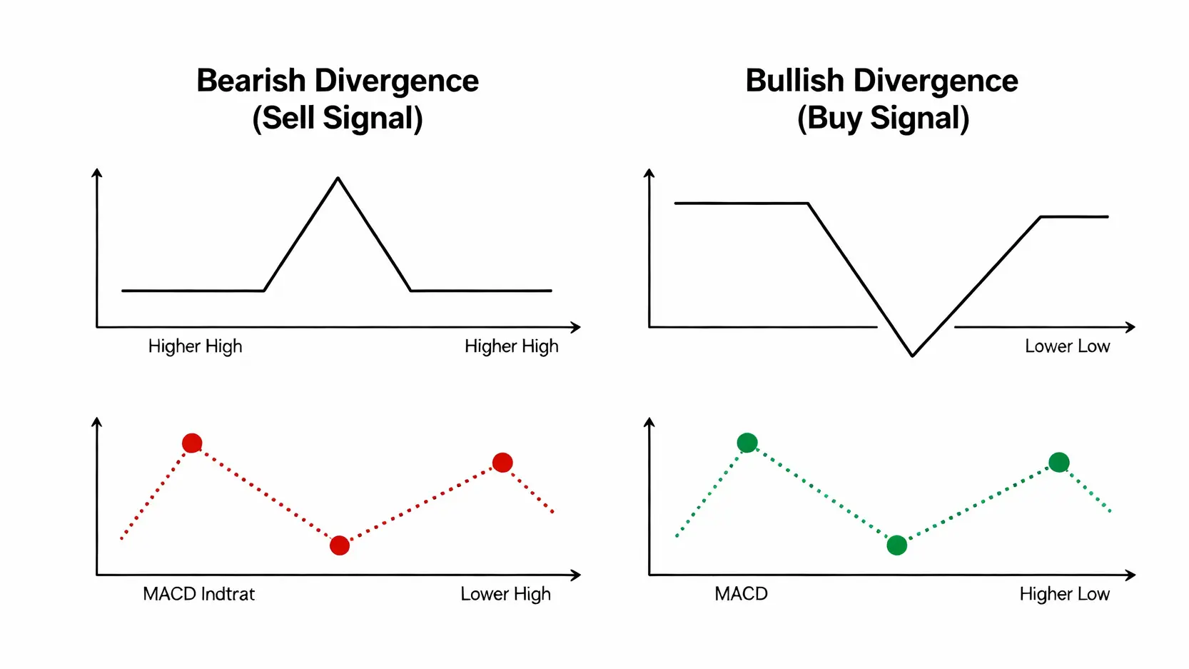
MACD Indicator Guide 2026: Golden Cross & Divergence

MACD Indicator Tutorial | Understand the Fast and Slow Lines, Histogram, Golden Cross, and Divergence in One Article!
Do you often feel overwhelmed when studying technical analysis, confused by complex MACD indicator tutorials, unable to understand the entanglement between the DIF fast line and the DEA slow line, and unsure how to interpret the market momentum reflected by changes in the red and green histogram bars? Especially when key “MACD divergence” signals appear, you may not know how to respond. In fact, MACD is a highly effective tool for judging the price movements of stocks, exchange rates, and other financial instruments. This tutorial starts from scratch and guides you through a thorough analysis of the practical meaning of the MACD fast and slow lines and the histogram, using illustrations to teach you how to interpret the most important buy and sell signals, so you no longer miss any market trends.
MACD Indicator Basics: Understanding the Core Components and Fundamental Signals
MACD (Moving Average Convergence Divergence), also known as the “Exponential Moving Average Convergence Divergence”, is a widely used trend-following indicator in technical analysis. Its core value lies in combining the advantages of moving averages while mitigating their lag, enabling investors to more sensitively capture the beginning, turning points, and end of market trends. To truly master MACD, you must first understand its three core components.
What Is MACD? The Three Core Components: DIF Fast Line, DEA Slow Line, and the MACD Histogram
A complete MACD chart mainly consists of the following three elements. Each serves a distinct role and together they depict the market’s bullish and bearish conditions:
- DIF Fast Line (Difference): This is the core of the indicator. It is calculated as “12-day Exponential Moving Average (EMA) minus 26-day Exponential Moving Average (EMA)”. As it responds more quickly to price changes, it is referred to as the “fast line”. The position of the DIF line represents the strength of short-term market momentum relative to long-term momentum.
- DEA Slow Line (Signal Line): This is the “9-day Exponential Moving Average of the DIF line”. Because it is smoothed again, the DEA line moves more smoothly and reacts more slowly, hence it is called the “slow line”. Its main function is to serve as a reference for the DIF line, and the crossings between the two form key buy and sell signals.
- MACD Histogram: Also known as the OSC bars, it is calculated as “DIF fast line minus DEA slow line”. The histogram visually displays changes in the distance between the fast and slow lines and is an excellent tool for measuring the strength of market momentum.

The relationship among these three elements can be simply understood as follows: the DIF acts as the pioneer, reacting first to price changes; the DEA acts as the commander, confirming the trend direction; and the MACD histogram acts as the war drum, showing the intensity of the battle between bulls and bears.
The Meaning of the MACD Histogram: How the Length of Red and Green Bars Reflects Market Momentum?
The MACD histogram is the most intuitive element for judging market momentum. Its essence lies in the “zero line” and the “length of the bars”.
- Above the Zero Line (Positive Zone): When the DIF fast line is above the DEA slow line, the histogram appears above the zero line, usually displayed in red (some charting software uses green, but the meaning is the same). This indicates a bullish-dominated market structure with stronger upward momentum.
- Below the Zero Line (Negative Zone): When the DIF fast line is below the DEA slow line, the histogram appears below the zero line, usually displayed in green. This indicates a bearish-dominated market structure with stronger downward momentum.
The length of the bars directly reflects changes in momentum:
- Red bars changing from short to long: Indicates that upward momentum is strengthening and bullish force is continuing.
- Red bars changing from long to short: Indicates that upward momentum is beginning to weaken, which may be a warning sign of a slowing trend or an impending reversal.
- Green bars changing from short to long: Indicates that downward momentum is strengthening and bearish force is continuing.
- Green bars changing from long to short: Indicates that downward momentum is beginning to weaken, selling pressure is easing, and this may be a signal that the trend is bottoming.
Observing the “convergence” and “divergence” of the MACD histogram is a more advanced technique than simply watching fast and slow line crossings. When bar lengths begin to shrink, even if price is still making new highs (or new lows), you should remain alert.
Basic Buy and Sell Signals: How to Interpret the “Golden Cross” and the “Death Cross”?
The crossover of the fast and slow lines is the most widely known trading signal of the MACD indicator and also its most basic application. Their appearance often signifies the establishment of a medium to long term trend.
🐂 Golden Cross (Golden Cross): Buy Signal
When the DIF fast line breaks above the DEA slow line from below, a “golden cross” is formed. This is usually regarded as a positive buy or long signal. The underlying logic is that the short term average market cost has surpassed the long term average cost, indicating that bullish momentum is beginning to gather and the trend may shift from bearish to bullish or enter a new upward phase.
- Signal strength: A golden cross that occurs below the zero line is generally more reliable than one that occurs above the zero line, suggesting that a strong rebound or recovery move may be about to unfold.
🐻 Death Cross (Death Cross): Sell Signal
When the DIF fast line falls below the DEA slow line from above, a “death cross” is formed. This is usually regarded as a warning sell or short signal. The logic is that short term market enthusiasm has faded and the average cost has fallen below the long term cost, indicating that bearish forces are starting to take control and the trend may shift from bullish to bearish or enter a corrective decline.
- Signal strength: A death cross that occurs above the zero line usually indicates a higher risk of trend reversal, as it represents the exhaustion of upward momentum.

It is worth noting that relying solely on crossover signals can easily generate “false signals” in ranging markets. Therefore, traders should combine the momentum changes in the histogram with the “divergence” phenomenon introduced next to make a comprehensive judgment.
Advanced MACD Trading: Using “MACD Divergence” to Capture Early Market Reversals
If the golden cross and death cross are the basic moves of MACD, then “divergence” is its most refined advanced technique. Learning to interpret MACD divergence allows you to spot early signs of an impending trend reversal ahead of most market participants, enabling you to position at the beginning of a trend rather than chasing highs or selling at lows.
What Is MACD Divergence, and Why Is It the Most Important Reversal Signal?
MACD divergence refers to a situation where “price action” and “indicator movement” are out of sync. Under normal circumstances, when price makes a new high, the indicator (such as the DIF value of MACD or the height of the histogram) should also make a corresponding new high, and vice versa. When this synchronous relationship is broken, it is referred to as “divergence”.
Divergence is important because it reveals that “the internal momentum of the trend has already weakened“. Imagine a sports car climbing uphill. Although the front of the car is still moving upward, the engine sound (which represents momentum) is getting weaker and weaker. This suggests that it is about to run out of power and may even start rolling backward. MACD divergence is precisely the market’s “engine sound”.
Illustration of Bearish Divergence: A Warning Signal of an Impending Decline
Bearish divergence is a strong sell signal that appears near the end of an uptrend. Its characteristics are as follows:
- Price action: The stock price (or exchange rate) makes higher highs, continuously setting “new highs” (Higher High).
- Indicator action: At the same time, the MACD DIF fast line or the histogram peaks become progressively lower, forming “lower highs” (Lower High).
This contradiction of “price rising while the indicator falls” suggests that although prices appear to be making new highs on the surface, the buying power (momentum) driving the rally has weakened significantly, “reflecting strength on the outside but weakness within”. Once bearish divergence appears, investors should remain highly alert and consider taking profits in stages or preparing to position short trades. Typically, a death cross that follows bearish divergence serves as a relatively reliable confirmation sell point.
Illustration of Bullish Divergence: Capturing Opportunities for an Upward Move
Bullish divergence is a strong buy signal that appears near the end of a downtrend and represents an excellent opportunity to buy at lower levels and position for a rebound. Its characteristics are as follows:
- Price action: The stock price (or exchange rate) makes lower lows, continuously setting “new lows” (Lower Low).
- Indicator action: At the same time, the MACD DIF fast line or the histogram troughs become progressively higher, “forming higher lows” (Higher Low).
This phenomenon of “price falling while the indicator rises” indicates that although the market is still experiencing panic selling, the underlying selling pressure (momentum) has already been exhausted, and bullish forces are quietly accumulating strength. The appearance of bullish divergence signals that the downtrend is nearing its end, and a rebound or trend reversal may be triggered at any time. If bullish divergence is followed by a golden cross, the success rate of the buy signal will increase significantly.

Common Questions About the MACD Indicator (FAQ)
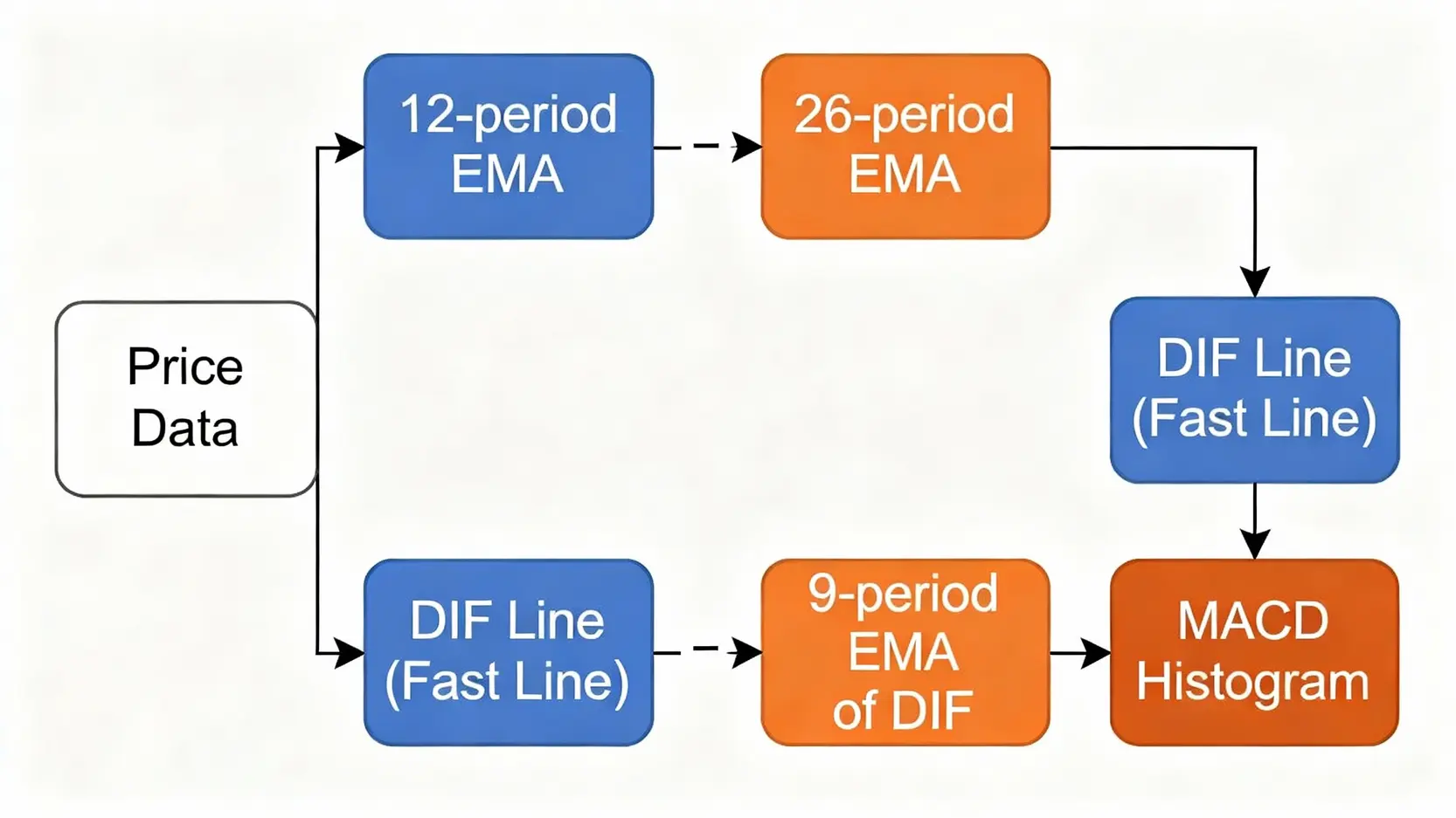
Q: Can the default MACD parameters (12, 26, 9) be modified?
A: Yes, but for beginners, it is not recommended to modify them lightly. This set of parameters, defined by the creator of MACD, Gerald Appel (12 day EMA, 26 day EMA, and 9 day EMA of DIF), has been tested by the market over decades and is suitable for medium to long term trend analysis across most instruments, including stocks, forex, and futures. If you wish to adjust the parameters, you must be clear about the purpose of the adjustment. For example, shortening the parameters (such as changing them to 6, 13, 5) will make the indicator more sensitive and able to respond more quickly to price changes, but it will also generate more noise and false signals, making it more suitable for short term traders. Lengthening the parameters (such as changing them to 24, 52, 18) will make the indicator smoother and filter out short term fluctuations, which is more suitable for long term swing traders, but the signals will be more lagging.
Q: Why does the MACD indicator become ineffective (desensitized) during consolidation?
A: MACD is a trend following indicator designed to capture and track market trends. In consolidation or range bound markets without a clear direction, prices fluctuate up and down within a narrow range, causing the DIF fast line and the DEA slow line to cross back and forth frequently near the zero line and become repeatedly entangled. This results in the indicator continuously generating “false signals” in the form of golden crosses and death crosses, leaving traders unsure how to act. This phenomenon is known as “desensitization”. Therefore, in sideways markets, MACD should not be used on its own. It is best combined with oscillators such as the KD indicator or RSI to assist in analysis.
Q: What is the difference between the MACD and KD indicators, and how should they be used together?
A: MACD and KD are two indicators with different characteristics, and using them together can create a complementary effect. The main differences are as follows:
- Indicator type: MACD is a trend indicator used to identify trend direction and strength, making it suitable for tracking swing trends. KD (stochastic indicator) is an oscillator used to assess overbought and oversold conditions, making it suitable for identifying high sell and low buy turning points in ranging markets.
- Signal speed: The KD indicator reacts very quickly and generates early signals, but it is also more prone to false signals. MACD reacts more slowly, with more stable signals, and can effectively filter out short term market noise.
Combination strategy: A common approach is “use MACD for the long term, and KD for the short term”. When the MACD indicator (for example on a daily chart) shows a golden cross above the zero line, confirming a bullish trend, traders can then switch to a shorter time frame (such as an hourly chart) and use the KD indicator to look for opportunities where KD forms a golden cross in the oversold zone (such as below 20) to enter long positions. This strategy of “following the major trend while trading against the minor trend” can effectively improve the win rate of trades.
Q: How can the MACD indicator be used to find optimal buy and sell points?
A: Finding optimal buy and sell points requires a comprehensive use of multiple MACD signals rather than relying on a single one. A relatively robust strategy is the “divergence plus crossover” dual confirmation method:
- Optimal buy point: Wait for a “bullish divergence” to appear in price action, which serves as a first level warning indicating that downward momentum is exhausted. Then, patiently wait for the DIF fast line to break above the DEA slow line, forming a golden cross as the entry confirmation signal. If this “golden cross” occurs below the zero line, its reliability is higher.
- Optimal sell point: Wait for a “bearish divergence” to appear in price action, signaling insufficient upward momentum. Then, wait for the DIF fast line to fall below the DEA slow line, forming a “death cross” as the confirmation signal to exit or initiate short positions.
This method, which combines leading signals (divergence) with confirmation signals (crossovers), can effectively filter out many whipsaws and false moves, helping you capture more reliable trend reversal points. For more authoritative explanations of indicators, you can refer to relevant materials on Investopedia.
Conclusion
In summary, the MACD indicator is a powerful tool for identifying medium to long term trends. Through this guide, you have learned the golden cross and death cross of the MACD fast and slow lines, the momentum changes reflected by the MACD histogram, and the most important MACD divergence signals. By applying this knowledge to your trading strategy and combining it with price action and other technical indicators, you can significantly improve the accuracy of your trend analysis. Open your charting platform now and start reviewing the charts to find the next potential trading opportunity!
Related Articles
-
Practical Applications of Volatility Surfaces: From Options Modeling to Advanced Skew Trading Strategies In options markets, implied volatility is never a flat line. Instead, it forms complex "smile" or "skew" surfaces. For advanced traders, mastering the practical applications of volatility surfaces is equivalent to possessing a lens that reveals market...2026 年 6 月 3 日
-
Building a Foreign Capital Flow Copy Trading Model: A Stock Market Indicator for Accurately Tracking Institutional Positioning In Asia-Pacific stock markets, foreign capital inflows and outflows often determine the direction of the index. However, simply looking at daily net buy and sell data is no longer enough. Only by building...2026 年 6 月 3 日
-
Options Buyer Strategies During Extreme Market Conditions: Black Swan Hedging and Cross-Market Arbitrage During Volatility Surges The most terrifying aspect of financial markets is not a gradual decline, but overnight flash crashes and cross-market capital withdrawals accompanied by volatility surges. In the highly unpredictable global macroeconomic environment of 2026, geopolitical...2026 年 6 月 3 日


