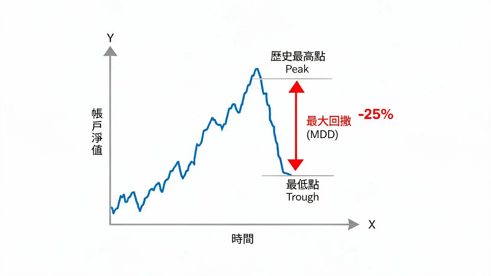
Maximum Drawdown (MDD) Measures the Worst-Case Loss Your Strategy Could Experience
To gain a deeper understanding of maximum drawdown calculations and management, you may refer to this article: What Is MDD? 5 Capital Management Secrets Used by Top Traders to Control Maximum Drawdown.
Sharpe Ratio: Your Risk-to-Reward Efficiency
The Sharpe Ratio measures how much excess return you generate for each unit of risk taken. Simply put, it answers the question: “Is this trade worthwhile?” A higher Sharpe Ratio indicates that your portfolio has stronger return potential under the same level of risk. For traders, pursuing high returns is important, but achieving an attractive Sharpe Ratio is even more important because it reflects superior profitability efficiency and stability. For further authoritative explanations of the Sharpe Ratio, you may refer to Investopedia definitions.
Profit Factor: The Relationship Between Your Profits and Losses
Profit Factor is calculated by dividing the total amount of profitable trades by the total amount of losing trades. The calculation is simple but highly meaningful:
- Profit Factor > 1: Congratulations, your system is profitable.
- Profit Factor = 1: Your system is operating at breakeven.
- Profit Factor < 1: Your system is losing money and requires immediate review and suspension.
Generally speaking, a stable trading system typically maintains a Profit Factor between 1.5 and 2.5. The higher this number, the stronger your profitability and the larger your buffer against losses.
Further Reading (Highly Recommended)
What Is MDD? 5 Capital Management Secrets Used by Top Traders to Control Maximum Drawdown
Essential Margin Trading Guide: 5 Key Strategies to Avoid Leverage Risks and Liquidation Disasters
Practical Excel/Google Sheet Template: Visualize Your Equity Curve and Maximum Drawdown
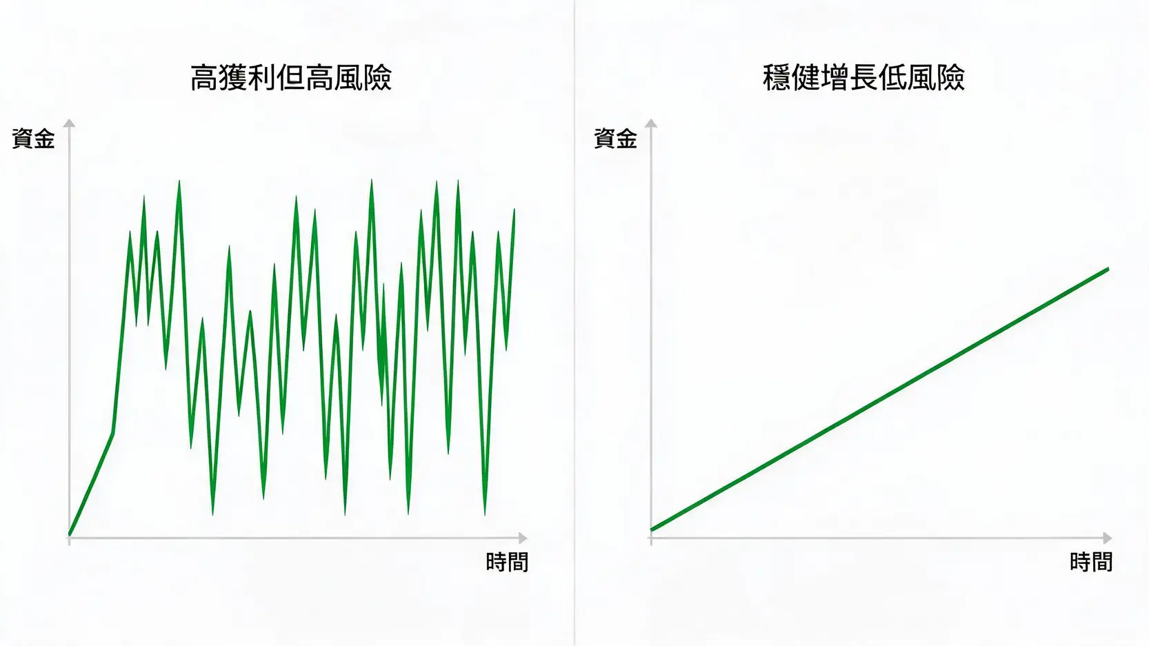
No matter how much theory you learn, practical tools are always more valuable. This carefully designed “Equity Curve Stress Management Template” simplifies complex trading performance analysis into an intuitive visual system, helping you eliminate trading anxiety.
Template Structure Overview: Trading Log, Equity Curve Chart, and Performance Dashboard
This template mainly consists of three interconnected sections:
- Trading Log: This forms the foundation of all data. You only need to input basic information for each trade, such as date, instrument, direction, and profit/loss amount.
- Equity Curve Chart: This is the core visualization component. The chart automatically updates based on your trading log, instantly plotting your account growth trajectory. Watching the curve grow itself becomes a form of positive reinforcement.
- Performance Dashboard: This section automatically calculates and displays all key performance indicators, including total return, maximum drawdown, Sharpe Ratio, Profit Factor, win rate, and more. It gives you a clear overview of your performance without becoming lost in raw data.
How to Use It: Spend Just Five Minutes Daily to Record and Update
Using this template is extremely simple and requires no advanced Excel skills. You only need to develop the habit of spending five minutes after market close each day:
- Open the Excel or Google Sheet template.
- Add several new rows within the “Trading Log” worksheet and input the day’s trading records.
- Done! The equity curve chart and performance dashboard will automatically update all data instantly.
Consistently maintaining these records will eventually turn this file into one of your most valuable trading assets.
Automated Calculations: Instantly Monitor Maximum Drawdown and Risk Metrics
The greatest value of the template lies in its automation features. In particular, the real-time “maximum drawdown” calculation automatically rescans your entire account history each time you input a new trade, immediately identifying and displaying the current MDD. This functions like an alarm system installed inside your account. When drawdowns approach your predefined risk limits, you can detect them immediately and implement appropriate risk management measures.
Psychological Stress Management During Equity Curve Drawdown Periods
No trading system rises forever. Drawdowns are an unavoidable part of trading. The ability to handle drawdowns is one of the key differences between winners and losers. Managing equity curves is not merely about managing data, but also about managing trading psychological stress during adversity.
Plan Ahead: Set Psychological Expectations Based on Historical Maximum Drawdown
Fear originates from uncertainty. If your template reveals that your system’s historical maximum drawdown is 20%, then when you encounter a future 15% drawdown, your mindset will remain significantly more stable. You will recognize that this remains within the normal operating range of your system rather than believing the world is collapsing. Preparing for worst-case scenarios is the first step toward maintaining trading discipline.
Reduce Position Sizes: Actively Lower Risk Exposure During Consecutive Losses
When your equity curve enters obvious drawdown periods, the worst possible reaction is attempting to “gamble bigger” with larger position sizes in order to recover losses quickly. This is often the fastest route toward liquidation. The rational approach is to proactively reduce position sizes and lower risk exposure. Doing so provides two major benefits:
- Protect Capital: Reduce losses and preserve resources during unfavorable market conditions or periods of poor personal performance.
- Reduce Stress: Smaller position sizes dramatically lower psychological pressure, allowing you to make more objective and rational decisions.
System Review: Has the Strategy Failed or Has Market Structure Changed?
When drawdowns exceed historical maximum levels, you must conduct a systematic review. You need to calmly analyze where the problem originates:
- Is It an Execution Problem? Did you strictly follow the trading plan, or did emotions lead to mistakes?
- Is It a System Problem? Has the strategy logic become ineffective under current market conditions?
- Is It a Market Problem? Have major macroeconomic changes fundamentally altered market volatility or behavior?
Only by using data analysis instead of emotional guessing can you identify solutions and guide your equity curve back toward growth.
Conclusion
Managing your equity curve means managing your entire trading career. It transforms abstract “market intuition” and vague “trading stress” into measurable, analyzable, and manageable data. Through the Equity Curve Stress Management Template and analytical methods introduced in this article, you can develop a deeper understanding of your own trading behavior while maintaining the calmness and objectivity expected of professional traders during inevitable account drawdowns. This is not merely an Excel tool, but a complete thinking framework and operational system designed to help you survive bull and bear markets while achieving long-term stable profitability.
FAQ About Equity Curves and Trading Performance
Q: What Should I Do if My Equity Curve Keeps Moving Sideways?
A: A long-term sideways equity curve usually means your trading system is operating at breakeven and lacks sufficient “edge”. This may come from several factors: 1. Your entry and exit signals are not precise enough; 2. Trading costs (such as commissions and slippage) are eroding your small profits; 3. The market is currently in a low-volatility consolidation phase that does not suit your strategy. It is recommended that you review your trading journal again, analyze the characteristics of profitable and losing trades, identify areas for improvement, or patiently wait for market conditions that better suit your system.
Q: How Much Drawdown Is Considered Normal?
A: There is no standard answer to this question because it depends entirely on your trading strategy style and personal risk tolerance. Generally speaking, high-frequency or short-term trading strategies tend to have smaller drawdowns, usually between 5%-15%. Long-term trend-following strategies, on the other hand, must tolerate larger price fluctuations in order to capture major trends, meaning their historical maximum drawdowns may reach 25%-40% or even higher. The most important thing is that the drawdown level must be clearly understood in advance and remain within a range you can fully tolerate both psychologically and financially.
Q: Is This Template Suitable for Stocks, Futures, or Forex Trading?
A: Absolutely. The core purpose of this template is to track changes in “account equity”, and regardless of which financial instrument you trade, the final results are ultimately reflected in changes to account equity. Therefore, whether you are a stock investor, futures trader, forex trader, or cryptocurrency trader, you can use this template to record and analyze your trading performance. The underlying risk management principles are universal.
Q: How Often Should I Update My Equity Curve?
A: It is recommended to update it at least once “per day”. Developing the habit of recording your trades after each trading day is the best approach. This not only ensures data remains current, allowing you to monitor performance changes immediately, but also creates an important sense of trading discipline and ritual. The process helps you conduct daily reviews, organize your thoughts, and avoid carrying the emotional impact of one trading day into the next.